Main connotation of our LOGO

The curve shared between "H" and "Y" cleverly uses the overall shape of Haoyu products, increases the visible area on the original basis, and continues the memory of the original Haoyu brand logo with the first letters of "H" and "Y"!
In the overall appearance movement, there are stable tubular forgings and elbow shape with local internal view, reflecting the industry attribute characteristics. From the whole to the local, the length width ratio is adjusted to the golden section ratio, and the golden ratio rule is followed to make the vision more stable and artistic!
The smooth curve and standard straight line in the figure form the classic visual symbol with curvature and degree. On the one hand, a single curve implies Haoyu’s own R & D, design, production, distribution and service of the whole brand assembly line, which has the impression of a big enterprise, which means that the enterprise’s business is going smoothly and its financial resources are rolling; on the other hand, the double straight lines, with square in the circle, symbolize that Haoyu’s various products and power system go hand in hand and work together to form Haoyu’s initial letter The link between Haoyu and the power system reflects the inseparable relationship between Haoyu and the power system. At the same time, the two straight lines 1 not only reflect the industry’s leading position, but also reflect the determination of building a first-class team and building an energy pipeline brand!
Standard font Haoyu and Chinese characters, the use of artistic deformation, a combination of Chinese and western, concise, atmospheric, emphasis on international market exchanges!
Standard color, is from the brand name "Haoyu" literal meaning of color association understanding, the vast universe Galaxy - technology blue, reflects the international trend and high technology content!

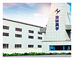
 mobile version